I’m so near to publishing my next novel, Flipside which will be available as an ebook on Amazon. I designed a cover a while ago, but somehow it isn’t quite right so I’ve been playing about a bit with the photo I want to use, which is one my husband took of some graffiti. I have changed it quite a bit and only taken a small part of the original picture.
I have made several different versions, but come down to two… I’m not sure if the font is right, I’m not sure if the effects are quite right either… what do you think? Your opinion will be valued! If you think they are both rubbish, I won’t mind that either!
 So which is better as a book cover? This one…
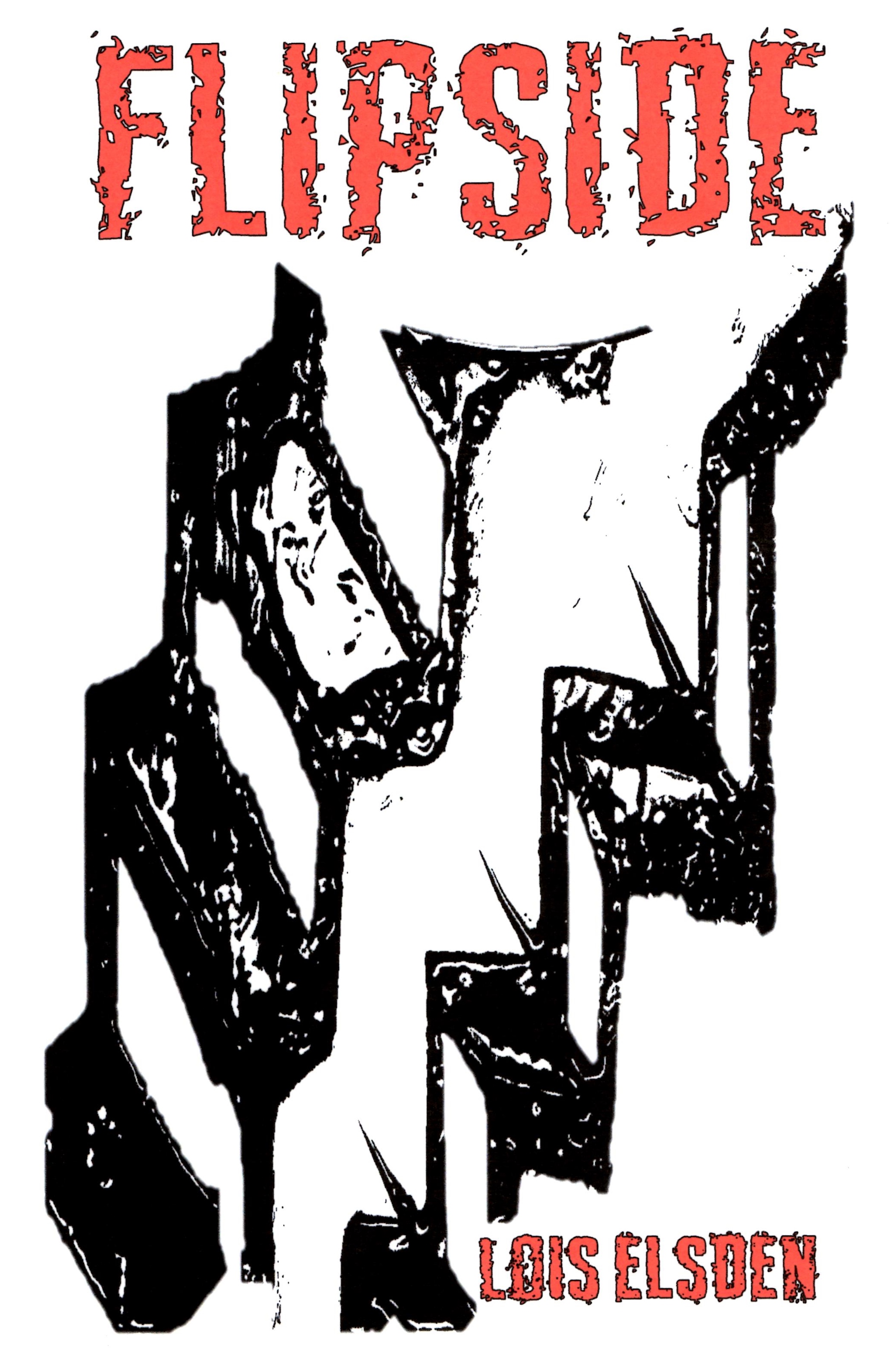 …or this one?


It’s SO difficult choosing covers isn’t it Lois! I’ve just been struggling with my new one, got it sorted, uploaded it for publishing and the edges were chopped despite the fact I sized it to specs!! I like your covers above. The first one is dynamic but somehow the title doesn’t stand out enough does it? I think this is because the tones of the colours (the background and the red) are too near each other. So if the print was darker than the background – or vice versa – it might stand out better! The second one is quite dynamic as it is, although because of the style of font the title isn’t strong compared to the background! It’s contrast that make things stand out I think. Just some thoughts – you ultimately have to go with your own gut preference! All the very best of success with your new book. xx
LikeLike
Thank you very much Ross, I value your opinion! Yes, i do see what you mean about the top one… it hadn’t struck me before so I’ll have a little play with it! I don’t really like the font of the second one so may try again and choose another colour! Good luck with your new one!
LikeLike
It’s a pleasure Lois. And looking again I think I prefer the second as it’s less confused and therefore has more impact! So maybe a change of font would be just what it needs. You’re nearly there – well done – I know what it takes! 🙂 BWs xx
LikeLike
Lois, I agree that the title and name don’t stand out enough though having said that I think the top one is the stronger design. Incidentally, I have designed a number of book covers myself. I wish you all the very best with your new novel and I’ll look it up..
LikeLike
Thank you! Thanks for your comment!
LikeLike
The second one definitely wins for me Lois. I want to make the stairs into one set with a mirror image or do something similar with the title, just to use the idea of flipside. Can you work it in easily? Or divide the cover vertically in halves with black-and-white artwork on one half and white-and-black on the other. Maybe too many suggestions, sorry.
The second one is the one!
And, Hearty Congratulations.
LikeLike
Ooooh, some great ideas! Thank you!
LikeLike
I’d say the first one really catches the eye and works well with the title:) Good luck with the novel, Lois!
LikeLike
Thank you!!
LikeLike
I prefer the second at the moment, but wonder if rather than red lettering on the first, white space infill may make them stand out.
Jim
LikeLike
Oh, good idea, Jim! I’ll try!
LikeLike