I think most people who have nothing to do with printing or design would admit that until word processors replaced type-writers, most of us wouldn’t know one font form another. Once we were offered a choice with the new technology some of us went mad and used all sorts of weird and wonderful and sometimes ridiculous fonts. People had their favourite fonts, and people had fonts they loathed. there were books written about fonts because publishers and designers had been using different ones in different ways for donkeys’ years. Now also we recognize fonts, we’ll look at a poster or advert and be able to name the font used.
I came across an interesting news item about a man who became obsessed by a font form the late nineteenth century. It was a very elegant and attractive font which was used by Dove Press in all its publications. The small London press was established by Thomas Cobden-Sanderson who was born in 1844 as just plain Thomas Sanderson, but took his wife’s name to make his impressive double-barrelled surname. His partner was Emery Walker who was by trade a process engraver.
Cobden-Sanderson was associated with the Arts and Crafts movement, and in 1893 he started first a book binding company, and then the Dove Press, named after a local pub. Cobden-Sanderson and Walker designed a font which was used in forty of the Press’s books as well as in other printed material.
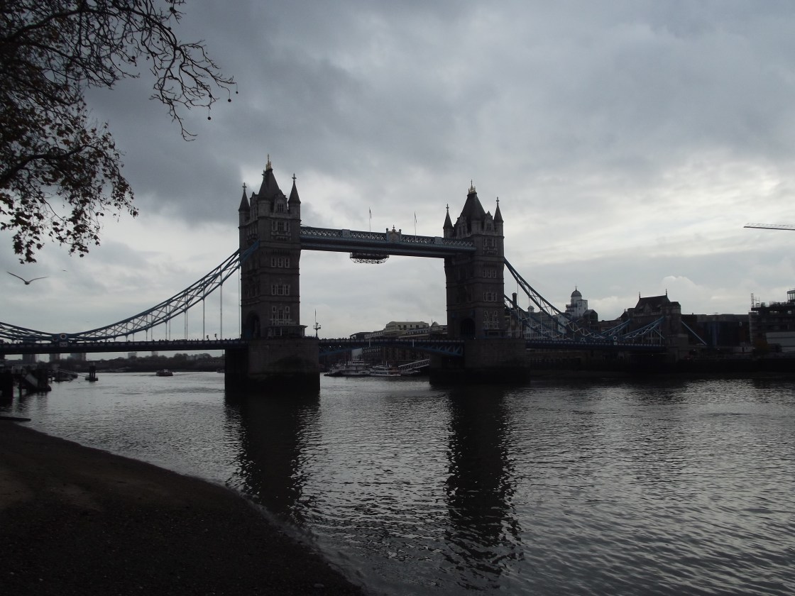
So how did it become lost? Cobden-Sanderson and Walker fell out and finished their partnership in 1909. Cobden-Sanderson promised that Walker should have a copy of the type – the actual little metal letters which were used in the printing process. However, he became what seems to have been a little paranoid, convinced that the font might be used in a commercial way by a mechanical press and so its aesthetic value lost. It seems astonishing, but Cobden-Sanderson threw the font into the River Thames so Walker couldn’t have it. he didn’t just throw it all in, he waited three years and then night after night went to the same spot on the banks of the Thames and threw some of the type into the water.
The news item I was reading was about a modern artist, Robert Green who worked out where Cobden-Sanderson would have stood… and believe it or not, despite the passage of time and the dangerous currents of the mighty river and the fact a bridge had been built nearby, Green found some of the type! he got two professional divers to search more thoroughly and altogether he has now got one hundred and fifty pieces! What a remarkable story!
Here is the news item:
http://m.bbc.co.uk/news/magazine-31534032
Thanks to a friend who shared this, there is another interesting article about the Dove press font:
http://www.typespec.co.uk/doves-type/


And for those who are curious, here is the digital font.
http://www.typespec.co.uk/doves-type/
LikeLiked by 1 person
Thanks for the link, James. It is interesting to see it as a set alphabet, but I’d love to see it actually used as text, wouldn’t you?
LikeLiked by 1 person
Agreed but finding copies of a publication is difficult
LikeLiked by 2 people
It would be amazing… I must investigate more!
LikeLiked by 1 person
What an amazing story. Or should I say a FONTastic story? Thanks for sharing it with all of us, Lois.
LikeLiked by 1 person
LOL, Mary!!
LikeLiked by 1 person
Sorry, it’s late and I just couldn’t resist. 😉
LikeLiked by 1 person